We propose to build an advanced prototype audiovisual system for discovering, identifying and classifying signals in large, multidimensional datasets. The proposal has a special, but not exclusive, focus on data from the astronomy, physics, biology and security communities. The system we propose will adopt and include proven state of the art tools for statistical pattern recognition, classification, filtering, and data processing. These will be offered as components that the user may select and use to first process and filter the domain data as required. The output results will be sent first to audiovisual software processing modules and then to rendering devices such as desktop, laptop or large HD screens and single or multichannel speaker arrays, the rendered data being controlled and manipulated by the user to optimize the extraction, discovery and recognition of signals. The prototype will thus comprise a highly functional contemporary toolkit for traditional data analysis coupled with new software for generating intuitive and novel visual and audible representations of the domain data. We place a strong emphasis on sonification, coupled with visualization, of the datasets, and believe that the fused sensory capability of this system will significantly enhance the ability of researchers to discover, identify and classify signals in large multivariate scientific datasets. For many of these, where we seek signal needles in gargantuan haystacks, being able to hear the needle, when we cannot see it, would make all the difference to the discovery capability.
In the proposal, we describe the wide range of techniques that are available for visualizing data, which are supported by existing software, and which we intend to utilize. We provide details of new techniques that we will develop and enhance, which will considerably extend the capability of our prototype system. A visualization and sonification hardware setup is detailed, which will allow maximum benefit to be gained from the software, which will nonetheless support more modest setups (including standard desktop computers). The setup will offer researchers a means of jointly studying domain datasets at very high pixel density. It will be coupled to a positional loudspeaker system for simultaneous sonification of the data. Since there is already a considerable body of research into sonification, we will benefit from, and make use of, those findings. However, we note that the scope of the existing work has largely been confined to the treatment of smaller datasets (such as work with EEGs) or has had an overriding focus on audio. In contrast, this proposal is targeting very large datasets. It thus describes a research and development program covering techniques and practical methods for processing and filtering such datasets so that they can rendered multi-dimensionally using a powerful marriage of complementary advanced visualization and sonification techniques.
Intellectual Merit: This proposal brings together, for the first time, sonification, visualization and powerful software techniques for the statistical analysis, feature extraction and classification of very large multivariate datasets. By adopting technology and best practices from several scientific disciplines, it aggregates tried and trusted visual analytics with new and novel visualization techniques. Moreover, it couples these with multidimensional sonification software to produce a system that will considerably enhance the ability of domain scientists to cope with the increasingly large datasets typical of the Information Age.
Broader Impacts: The prototype system will demonstrate the general utility of combining visual and audible representations of multivariate data. It will be immediately useful not only to domain scientists working in physics, biology, and security, but also to anyone dealing with large quantities of data. The novel, and configurable, visualization and sonification methods will appeal to researchers of all ages and levels of experience: it will allow them to gain new understanding of, and make discoveries in, their data.
We propose to build an audiovisual system for discovering, identifying and classifying signals in large, multidimensional datasets. The proposal has a special, but not exclusive, focus on data from the astronomy, physics, biology and security communities. The system we propose will adopt and include proven state of the art tools for statistical pattern recognition, classification, filtering, and data processing. These will be offered as components that the user may select and use to process and filter the domain data as required. The output results will then be sent first to audiovisual software processing modules and then to rendering devices such as HD screens and multichannel speaker arrays, or standard desktop computers, the rendered data being controlled and manipulated by the user to optimize the extraction, discovery and recognition of signals. The proposed system thus comprises a functional contemporary toolkit for traditional data analysis coupled with novel and intuitive software for generating visual and audible representations of the domain data. We believe that the multidimensional sensory capability of this system will significantly enhance the ability of researchers to discover, identify and classify signals in large scientific datasets.
A significant fraction of the work described in the proposal is devoted to the development of methods and techniques for mapping complex scientific data to audio signals. The challenges are numerous: deciding which data variables are most suitable for sonification, understanding how the data should be processed or refined into an appropriate format, converting the data into sounds or music by taking into account aesthetic as well as technical considerations, placing the sounds in the soundstage by the use of multichannel or phase related techniques, and positioning them according to a suitable data property, coupling the sonification process to the visualization process so that they remain in lockstep, allowing the user to control, modify and refine the process according to taste and as the dataset is moved around in, explored or “drilled down”, and matching the processes to the capabilities of the target device. We target group meeting rooms equipped with multi-HD displays, a multichannel sound system and a good sound synthesizer as well as desktops with good graphics and stereo sound, and potentially handheld devices with limited screen space and mono audio. We address the aesthetic considerations of sonification, which should not be underestimated. A system that produces a cacophony of noise will be off-putting and unpleasant to use: the user will just turn the sound off or not use it. The sounds must be pleasing and make sense. This is a subjective area and needs to be supported by a configuration scheme that allows the user to specify the types of sounds that make sense to her/him when a particular class of data is being represented.
For many disciplines and areas of research, the Information Age has brought with it the possibility of amassing very large amounts of multivariate domain data from many sources. These data are collected and stored easily but present a significant computational challenge when it comes to analysis, a necessary step towards the goal of understanding their general and specific properties. Multivariate statistical analysis is a set of techniques that are used to allow decisions and discoveries about the data to be made, and knowledge gained. In this proposal we focus on techniques that are applicable to the large datasets being handled in the physics, astronomy and security communities, but we believe to be generally applicable. These include probability density estimation, signal/background discrimination, detection of regions of interest, and function approximation.
There are many mature software tools and packages that support the techniques listed, and we do not propose to develop any new tools in this area ourselves. Instead we will adopt a system such as R[1] and link it with other software as necessary, so providing an environment that can be used according to need. The known required functionality includes the following techniques for multivariate analysis: pattern recognition, feature and signal extraction and classification, and specifically: Quadratic and Linear (Fisher) Discriminants, Principal Components, Clustering, Decision Trees and Bagging/Random Forest, Neural Networks, Genetic Algorithms, Regression[2].
There is also a standard set of visualization methods that can be employed together with the statistical methods described in C.2. We intend to use a) Scatter/Glyph Plots, b) Parallel Coordinates, c) Spider/Star Plots, d) Layering of images/information, e) 3D representations, f) Color and texture, g) Movement, jitter, spin and translucency. In addition we will employ a new method (inspired by this proposal), that allows the intuitive representation of several variable values by a single glyph. The goal here is to explore the maximum number of variables that can be presented to an expert user on a display surface of a limited size, in a meaningful way, while retaining visual clarity.
C.3.1 Novel Glyphs for Multivariate Data
It has been shown that the use of abstract graphics icons to identify classes of information (e.g. files and directories in an operating system) [[1]] is a powerful technique. We propose [[2]] an extension of this idea for multivariate data in which 3D glyphs are created that a) map two of the variables for each datum to shape and color, b) a third and fourth variable to a number of arms on each side of the glyph, and c) a fifth and sixth variable to the position of the glyph on the screen (a seventh variable could be used to map a 3D position). Thus each glyph can represent (if coarsely) up to 7 variables. Figure 1 shows this scheme in use to show features in Monte Carlo simulation data from particle physics, where Higgs boson signal events are concealed beneath a huge background of less interesting events.
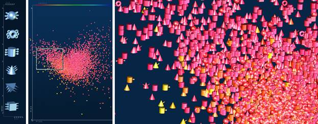
Figure
1
A dataset from particle physics, containing a mixture of di-photon Higgs signal
events mixed with copious numbers of background events. Six unique glyphs,
shown at the left, indicate the angle between the photons. For each glyph, the
number of “arms” to the left and right indicates the energies of the two
photons respectively. Following a Principal Components (PC) analysis of the
data, the glyphs are rendered into a scatter plot (middle) and located there by
mapping two of the PCs to (x,y). The color of the glyph is mapped from the
calculated invariant mass of the di-photon pair. A closeup view of the framed
area (right) shows individual outlier events.
C.3.2
Eigenvalues of
Graph based data
The graph is a powerful mathematical concept that unifies many technical fields, the idea of abstract nodes connected in pairs through abstract edges. Graphs and sparse matrices can represent many of the data structures encountered in security studies, such as telephone calls, social connections, supply and retail chains, transportation graphs etc.. They are also prevalent throughout the scientific world: atomic bonds, polymers, spin-glasses, biological networks and signal pathways etc.. Deeper understanding of these graphs is possible when they are rendered at multiple levels of detail, from an overall view of large scale features to views allowing the discovery of key nodes, sub-graphs and clusters. A novel technique which we will use in this project is to calculate and visualize/sonify the eigenspectrum of the graph data. An eigenvector of a linear transformation is a nonzero vector which, when that transformation is applied to it, may change in length, but not direction. Even though a system may be complex and interlinked, the eigenvalues and eigenvectors split that complexity into a set of simpler, independent entities, each of which has a length/eigenvalue (or strength) and does not mix with other vectors. The eigenstates contain all the information that the original graph has. For example, the eigenstates of a social network graph are the large-scale sub-networks and central figures in that network. Physically, the eigenspectrum is analogous to a "masses and springs" model of the graph where the eigenvalues are the resonant frequencies of the collection.
Scientific data visualization is a set of techniques that allows us to gain insight and understanding of data by use of our visual processing system. With sonification[3] [[3],[4]] our auditory processing system is employed to the same end – the data are represented audibly rather than visually. The ear is sensitive to signal intensities ranging over more than seven orders of magnitude (from a whisper to an explosion), frequencies over four orders of magnitude, and can discriminate between tones whose pitch differ by less than a percent. Humans tend to be more responsive to auditory rather than visual cues, and we have a greater perception of intensity and spatial position with auditory signals. Compared with the visual system, the auditory system is more attuned to periodicities, quasi-periodicities and aperiodicities in the signals it is processing. Sound signals can carry significant amounts of information, both instantaneously and in time: the auditory system is capable of processing these complex signals in real time and can filter unwanted noise or backgrounds. Thus 3D aural information is a compelling addition to traditional scientific visualization systems, as it adds extra valuable dimensions to the representation of objects.
C.4.1 Perception & Audio
In most animals, the primary role of audio is to direct visual perception. Hearing is omni-directional, so dangers from any direction can be detected, and vision directed to the source. In humans, speech and music make audio the primary information channel. A large percentage of a person’s information arrives via speech. Music exercises our ability to distinguish individual sounds from a composite using what is referred to as auditory scene analysis, or stream segregation. This ability to separate out individual streams from a mass of sounds represents an opportunity to use sound to represent composite data sets and use the auditory pathway to pick out streams of interest.
There have been efforts in the past to promote the use of audio as a means of conveying information contained in scientific datasets. In “Data Sonification and Sound Visualization”[[5]], for example, a system is described in which data variables are mapped to a superposition of sine waves whose amplitudes and frequencies are functions of the variables. The system used, DIASS, was coupled with the “Cave” virtual reality (VR) system to show and hear data from both molecular chemistry and materials science datasets. The researchers claimed that “The combination of visual images and sounds provides an extremely powerful tool for uncovering complicated structures.”
Some scientific or security data is already audio, or very easily mapped to audio, such as audio recording, gravitational wave measurements, periodic parameters of celestial objects, UV, optical or infra-red spectra, and so forth. Other data can be mapped to e.g. space filling curves that allow an intuitive path to be constructed through all points in the dataset while preserving location or “closeness” – similar data points tend to be adjacent on the curve. Alternatively, tabular data can simply be ordered on a single variable, so allowing that variable to represent time, and the some of the remaining variables used to sonify each row of the table. In general, what makes sense for one type of data may not make sense for another, and the user must select a mapping from a menu of those available.
Once a mapping to audio has been chosen for a particular dataset, the mode in which the audio is played requires careful consideration. Simultaneously rendering the audio information for many thousands of data points in a visual display would likely result in a cacophony of sound that conveys no useful information. On the other hand, the “cocktail party” effect, where certain words familiar to the listener (such as his/her name) are instantly recognizable in the general hubbub, might mitigate this problem given a suitable sonification scheme. Also, placing sounds so that they come from different direction can allow easier separation of sources.
Another approach is to scan the visual scene with a band, rather like it is done with sonar: the band sweeps over objects in the scene, and the objects swept over become audible for the time the band is overhead. By repeatedly sweeping the scene, and allowing the user to pause, slow down or speed up the sweep, audible features could be identified. The scene might then be zoomed, and the process repeated, so homing in on the objects of interest. Bands could move from left to right, top to bottom, or outwards from the centre, in rings, or sweep radialy as done in sonar. A complementary approach might be to sonify a region centered around a mouse cursor, with amplitudes proportional to the inverse square law to decrease the amplitudes of sounds more distant from the cursor.
To map pitch onto a large data set, it is probable that we could hear sound clouds as an undifferentiated mass of sound. We are good at hearing if a sound complex is harmonic, or inharmonic. So mapping to harmonicity is another possibility for a large data set. Picking out individual pitches from a large sound cloud might be hard. Another possibility is mapping to spectral centroid - this is a simple measure of brightness and is calculated similarly to mass centroid, but with the spectrum of a sound. The more energy that high frequencies have relative to low frequencies, the higher is spectral centroid.
C.4.2 Candidates for sound sources
Choices for mapping data sets into individual sounds requires creative design in much the same way as the selection of suitable glyphs or other visual objects to represent data graphically. Some general categories of sounds are: a) simple tones, b) complex polyphonic tones, c) natural world sounds (birdsong, insect noise, etc.), d) musical instrument sounds, e) speech. All of these can be parameterized, and thus mapped from generic multivariate data. Specifically, when generating the sounds in these categories, the techniques used can be divided into two major families, sampling & synthesis.
C.4.2.1 Sampling
Sampled sounds are one of the most dominant synthesis methods for music. The principle behind sampling synthesis is quite simple. Real world sounds, such as musical instrument notes, or sound effects, are recorded and stored digitally in memory on a computer or musical instrument. Individual sounds are then played back by reading from memory. The trigger to start playback can be a note on an electronic music keyboard, for example. Sounds such as pianos or other traditional acoustic instruments can be reproduced with high accuracy. Sounds can also be triggered under software control, of course. Today, sampling musical instruments on personal computers are fully as powerful as dedicated musical instruments from the 1980s and 1990s which had dedicated hardware to record and playback sounds.
Recorded sounds can be any sound, not just musical instrument notes. Sound effects for film and video have been generated for many years using sampling instruments or software.
However, sampled sounds are harder to parameterize. It is easy to modify some parameters of sampled sounds such as pitch, loudness, duration, brightness (using simple filters), but beyond these basic parameters, pre-recorded sounds are not very malleable.
Additive synthesis, using short time Fourier analysis plus re-synthesis using sine waves is considered by some to be a generalized sampling technique. These methods promise more sophisticated methods for modifications of sounds at playback, but in practice, often fall short of expectations.
C.4.2.2 General music synthesis
techniques.
Synthesized sounds are less realistic, but much easier to parameterize. Many techniques for sound synthesis are in common use, and software is widely available in open source or commercial form. Digital emulations of early analog electronic music synthesis techniques are widely implemented in software. Basic techniques for generating waveforms are well understood.
Sound synthesis using FM (frequency modulation) is a very efficient and simple technique which can generate a wide range of timbres. It is quite easy to mimic the sounds of birds and insects using FM.
A major family of synthesis techniques is physical modeling. Physical modeling uses simplified models of physics of the sound production mechanisms for musical instruments or sound sources. Physical models often provide useful behavioral modeling of the instrument. For example, physical models of car engines have been commercially successful in computer video game design. These models have the feature of allowing control over intuitive parameters of the sound generator, such as engine size, number of cylinders, RPM, muffler resonant frequency (which is dependent upon size). Physical models of struck objects like drums allow intuitive control over size, material properties, etc.
C.4.3 General goals
Sounds must have "dignity", be socially
acceptable, not risible, trivialized or
potentially offensive. Sounds have a great power to annoy or fatigue listeners.
C.4.4 Acoustic Process vs. Acoustic parameter
Sound synthesis methods can be used to create an “audio metaphor”. We are all familiar with an endless array of physical processes that have immediately identifiable signatures. Examples include bouncing balls, car engines, applause, kitchen sounds, office sounds, seashore sounds, etc.. Acoustic signatures can be regarded as an acoustic “process”. When creating synthesized sounds, it is common to create synthetic processes that correspond to a physical process or to a totally new abstract process. It is straightforward to map the sonification data onto process parameters. Simple examples could be the speed of a ball’s bounce, or the physical size of a bouncing ball, size of a car engine, repetition rate of a chirp, etc.. The chosen mapping can be considered as an audio metaphor.
C.4.5 Spatialization
Once choices for sound sources and mapping to a data set are chosen, a very important enhancement of sonification is the spatialization, or positioning of, the sound sources. Spatialization is a well established and mature technique: software libraries are available for most common operating systems.
The basic idea is to take a monaural sound source, and reproduce the cues used to localize a sound in 3-dimensions. There are a number of spatial audio cues: Interaural Time Delay (ITD) - the time delay between the arrival of a sound in one ear versus the other ear can range up to about 750 microseconds. Humans use ITD to establish left-right localization using ITD. We can resolve less than 1 degree of angular location for sounds directly in front of our heads, depending upon the type of sound. Interaural Level Difference (ILD) sounds have different amplitudes at different ears depending upon which side of the head the sound source is on. Ratio of direct to indirect signal distance cues are strongly directed by this ratio; the further away a sound is, the more room reflections are heard, relative to the direct signal. HRTF – Head Related Transfer Function Front/Back disambiguation is driven by several factors. When head movement is not allowed, the pinna (the outer ear) filters sounds so that those from the rear have a different frequency response those from the front. Similarly, sounds from above the head have specific notches at characteristic frequencies that cue elevation. When head movement is possible, listeners use it to confirm front back and elevation cues. Head movement allows the listener to use the much stronger cues of ITD and ILD, which dominate over HRTF. Head movement based cues are feasible when speaker arrays are available, to put speakers behind the listeners, or even above them. With headphones, head trackers allow head movement cues. Spatial cues have a hierarchy. ILD cues are weaker than ITD cues. So if they conflict, ITD overrules ILD, until the ILD is unbelievably larger than the ITD. ITD is derived from cross-correlations performed in neural circuits safely internal to the brain, while level differences can be perturbed by something as simple as wax in the ear. HRTF cues are weaker than either ILD or ITD.
C.4.6 Sonification Software
A
variety of open source software packages are available that support
sonification, including Csound[[6]],
ChucK[[7]]
TAPESTREA[[8]],
and Supercollider[[9]]
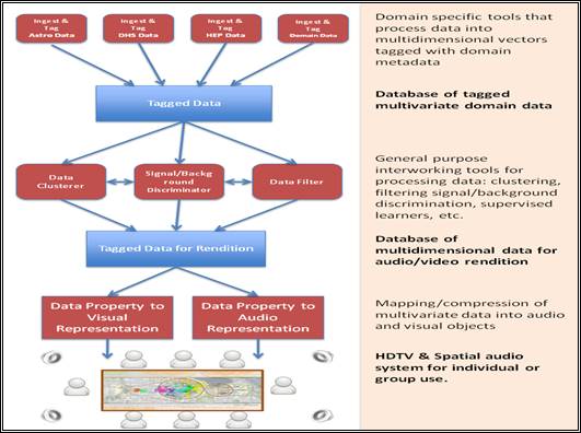
Figure 2 An overview of the prototype audiovisual cueing system
The operation of the prototype system is described in the following sections.
C.5.1
Ingestion of
domain-specific data
This is a collection of tools that allow domain data to be brought into the system for audiovisual cueing. These tools tend to be domain-specific codes that convert domain data into the tagged data the system uses. For Astronomy there would be an ingestion tool for FITS files. For HEP there would be a tool for ingesting ROOT files. Other tools may be more general, but serve the same purpose: tools for processing plain text or CSV files or spreadsheet data, SQL database export/import tools, and so forth. A simple schema is provided that allows domain data to be easily mapped into the required format, so that new types of data can be easily accommodated by the system when required.
This ingestion step is concerned with depositing the domain data, together with any required metadata, into the cueing system’s database. This database is conceptually simple: it contains tables of multivariate data with relationships to the provided metadata. We believe that the vast majority of domain data, while not necessarily in tabular form, can be represented as tables in a database having a suitable schema.
C.5.2
Data processing
The data processing step is where the domain data are processed in order to extract information, patterns, clusters, signals, and so forth. The required processing is carried out by zero, one or more modules, which are selected from a palette, and which can be placed on a workflow canvas and connected to the source database or one another. The modules contain standard filters, data clusterers, signal discriminators etc.. The available modules include a standard set, and can include specialized versions provided by the user.
The data processing configuration adopts a Visual Programming, or “pipes” paradigm, which will be familiar to users of e.g. Iris Explorer[4], Yahoo! Pipes[5] or LONI Pipeline[6]. The user is presented with a palette of available modules which s/he can drag individually onto the canvas. Each module is configured separately, using the available widgets that appear within it. The modules are connected together with pipes, which define the flow of data in the system. There will be only one input data source to the workflow: the database of tagged multivariate data, and only one output from the workflow: a database that will be used to render the data in the audiovisual cueing system.
C.5.3
Conversion of
Data to Audio/Visual Representations
After data processing, the system allows the user to select ways of mapping the processed data into visual and audible objects, which are then rendered by the hardware. The software that implements these mappings is one of the major research goals of this proposal, and the design is detailed below. As an example, in this step, the user may choose a subset of the data variables to be mapped to glyphs, and another subset to be mapped to sound. The appearance of the glyphs would be adjusted, as would the sonification, while observing and listening to the hardware.
To illustrate better the wide scope of application of the audiovisual cueing system, we describe in this section several possible use cases.
C.6.1
Security Use Case
C.6.1.1 Hypothetical Potential Incident at the Presidential Inauguration, 2009
On January 20, 2009 a crowd of nearly two million people have descended on the National Mall to witness the inauguration of the new US President. Security on the ground is unprecedented; however there is a need for a higher level of situational awareness to monitor the Mall and surrounding areas, detect and prevent potential incidents, and coordinate responses. At a remote location, a few analysts are monitoring the inauguration around a situation table composed of off-the-shelf technology including quad high-definition displays, surround sound, and user interaction devices (see Figure 3). The system is portable and can be deployed wherever there are adequate data links and power.
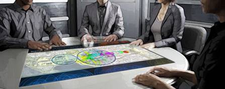
Figure
3
Prototype Situation Table in use (Top) with a display showing the National Mall
during the inauguration. The table is of sufficient size that several analysts
can view and listen at the same time. An example layout of the graphics and
control elements is shown (Bottom) as are the speakers that generate positional
sonification information.
Ultimately, our system addresses the ability to maximize the amount of information presented to a small team of analysts, in a way where they can explore, reduce, and understand information, leading to more coordinated and effective responses.
C.6.1.2 Data Sets and their Reduction
In this situation there are many possible data sources. A primary example is cell phone call information logs. If we assume about 3 phone calls or text messages per person are made during the event, then there are potentially about 3 million cell events. For each of these, the log contains the destination, time, length, and a global position for the call. In addition, depending on the call endpoints, processed content data may be available including voice, text, images, video, and sound. Since the system is portable, rapid deployment outside of the USA is possible which may lead to fewer data restrictions.
By analyzing the call logs, we need to identify security threats. To assess threats we can track outgoing calls (classifying them as national or international), incoming calls, and calls between individuals at the Mall. This data is represented as a connectivity graph. We can also trace the frequency of calls made, and from this discern a certain urgency value to each call. To this we can add further information such as assigning higher threat probability for calls made to known terrorists, criminals or world regions, and whether used numbers have been reported as stolen or hacked. We can cross reference the origin and destination of a call with a database of "people of interest". Other sources of relevant data include video (webcam) and audio (listening device) monitoring information, Twitter stream keyword hits, and so on. From these data streams we can build a large database of events, with many associated or linked items of interest. While it may eventually be possible to design an automated system to process the data and create a manageable list of events for closer human examination; in a time-critical situation, a better approach is show as much of the data as possible to trained human eyes and ears, and allow them to pick the pertinent information. To do this, we propose to use well-known statistical methods to first quickly, efficiently, and accurately clean up the data, decompose it into more manageable/independent structures, create clusters of data with high similarity, and finally construct/classify the data into trees of clusters that allow analysts to navigate the data at different levels of abstraction.
C.6.1.3 Presentation and User Interaction
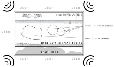
The data is presented to the users via the situation table as shown in Figure 3, but is also available via laptop and mobile devices. We can present the data to the users in either a purely abstract space, or if useful, back onto a standard locality map. Immediately we can use the more independent or "urgent" of the variables to further code information on the map, using color, shape, and even mild spin and jitter motion. We will also encode higher levels of supplemental information sonically, and use the space coherence to give it further relevance.
As information is processed we can automatically suggest “bubbles” of interest, which can be further illustrated by docking additional visualization widgets, layered on the outside of the main viewing area, as shown in Figure 1. As the analyst’s attention is drawn to a specific region via sight or sound, or even creates manually a new region of interest, we can show further detail through these supplemental layered graphs and event visualizations, as well as codifying with sound the detailed selected data. With a spatial audio capability, it should be possible to localize sound to specific bubbles, resulting in the users listening to the bubbles. In this way, both sight and hearing are engaged simultaneously.
Analysts could select, perhaps dynamically, from a “scale” of sounds and associate particular sounds to selected event types. Non-selected events would just produce “white noise” from which increases of selected events would rise up and present themselves. With some small amount of training an analyst could probably follow complex selected events concurrently and then when a threshold is exceeded focus on the particular scale of events while filtering out the rest.
C.6.2
Astronomy Use
Case
Modern astronomy data sets’ like the Sloan Digital Sky Survey (SDSS) often consist of very large tables of cardinalities in the hundreds of millions, with several hundred attributes. Even making a simple scatter plot showing possible outliers is a non-trivial task, if one needs to plot a billion points. There are several indices built on these tables, including various space-filling curves. How would one go about finding various correlated trends in a 400D space, without an obvious distance metric? One can imagine turning the data into a time series, using an ordering along one of the attributes, and then turning the selected attributes into a time series of events. If those column values are uncorrelated, we would hear a noise, while for a correlated pattern a more coherent sonic image would appear. JHU postdoc Mark Neyrinch has generated a sonification of the galaxy density in the world’s largest cosmology simulation, the Millenium, using various non-linear transformations of the density distribution. The sonic difference is striking, even plots of the 3D power spectra look similar. Much of this is due to the fact, that statistical techniques, like power spectra, are insensitive to phases/shapes, while sonification (in particular when combined with visualization) can reveal shapes and sharp features.
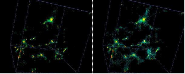
Figure 4 3D density in a large cosmological
simulation, modulated by music (M. Aragon-Calvo, JHU).
In very large numerical simulations it is often difficult to visualize scalar fields in a volumetric fashion, since the fields rendered often mask one another. One customary way to render such fields is to draw iso-density surfaces, and interactively vary the density threshold. JHU postdoc Miguel-Araqcon-Calvo has developed a novel way of rendering such information: he sets the color and transparency of each voxel according to the intensity and tonal character of an external audio source (see Figure 4). As the music is playing, it dynamically modulates the visual display, and from the simultaneous audio and visual data stream the brain (remarkably) re-synthesizes the complex density structure in the data volume. This dynamic modulation works much better than does e.g. sweeping sliders. By mapping parameters of the sound to the visualization, one can create a “randomized” multi-dimensional sampling of many parameters simultaneously, in a way that is pleasing to our perception[7].
C.6.3
Structural Biology
Use Case
Single particle analysis is a technique for reconstructing density maps of biological macromolecular assemblies from low resolution, low contrast, noisy electron micrographs. These maps reveal the overall structure of protein complexes and are thus of great importance in our understanding of diseases, drug making, and cell regulation. The common belief is that the success of the technique partially depends on the availability of a large number of projections representing all possible views of the three dimensional geometry of the macromolecular complex. Developments in electron cryomicroscopy enable recording of larger micrographs each containing hundreds to thousands of these two dimensional projections, called particles, embedded in vitreous ice (see Figure 5A-C).
When averaging projections assigned to the same viewpoint one can create a single angular projection with stronger signal–to–noise ratio representing the whole class. Tomography is then employed to generate a 3D reconstruction from all these representative projections. All these steps rely on developments from information theory and statistics (classification, selection), applied mathematics (reconstruction), and computer science (efficient algorithms). The sheer size of contemporary micrographs, each easily containing millions of pixels, makes the whole process computationally demanding.
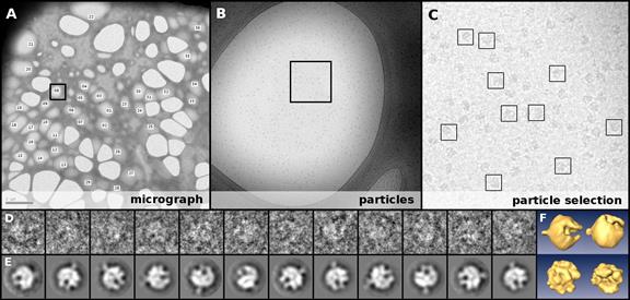
Figure 5 Single particle analysis reconstruction
pipeline (A-F). The goal is to reveal the shape of a single 3D macromolecular
complex from noisy, low contrast, randomly oriented, and dispersed projections.
A: an electron micrograph containing thousands to millions of examples of the
macromolecular complex plunge frozen in vitreous ice, labeled with regions
containing projections. B: the enlarged framed region of A where the presence
of structures is already evident. Each copy of the macromolecule in the
micrograph is a particle (shown in B and at 1:1 scale in C) - 2D
projections of the unknown 3D complex. These are individually, and laboriously,
collected by manually placing a box C, an error prone process. Particles in the
D row have been normalized to improve their contrast and posterior classification
and averaging. In E a set of particles with higher signal–to–noise ratio are
shown after classifying and averaging aligned particles. The final result, F,
shows the 3D tomographic reconstruction. Data courtesy
of Zhiheng Zhu, Caltech.
The major difficulty of the technique is that micrographs are typically of poor quality preventing a straightforward analysis (automatic selection, classification, pruning, and averaging of particles) and thus calling for manual intervention at some important steps. Selecting particles – boxing – in a micrograph is usually done completely by hand (see Figure 5 C) and it might take weeks for an experienced biologist to collect a statistically significant sample, which may contain at the end many false–positive particles. The development of robust algorithms for automatic selection has been an active area of research for some years but we are still far from offering satisfactory solutions to practitioners. Biologists faced with rudimentary and less than perfect tools end up mistrusting the algorithmic approach and prefer to use manual boxing so as to have full control of the results, despite this being a tedious and inexact process. This will be familiar to those working on automatic image segmentation: manual segmentation of intricate anatomical parts (e.g. brain, heart valves) to detect abnormalities is preferred to automatic approaches.
Correct classification of selected particles is an important step to achieving high quality reconstructions. While sophisticated supervised classifiers exist, there are serious difficulties when dealing with contaminated images. Research has shown that eliminating extraneous data is advantageous. For example, in [[10]] the authors showed that removing imperfect (noisy, incomplete, ill–formed) images from a dataset of human faces (as opposed to enlarging the dataset with additional training images) improved classification, and further evidence of the benefits of pruning are given in [[11]]. In that work, the authors showed how to reconstruct density maps to obtain higher resolution and detail previously not seen, by using just a few tens of the best imaged particles from an initial dataset of tens of thousands of semi–automatically selected particles. The suggestion is that the identification of thousands of such particles from within datasets containing millions of images is likely to be critical to achieving the best resolution in cryomicroscopy single particle density maps, in complete agreement with the findings of [11].
In the context of this proposal, we imagine using audiovisual cues to detect the faulty data in both particle selection and classification. This is in line with is currently being proposed for the other scientific areas (detect and report the outliers). The visual system would allow us to easily pick regions of interest in the micrographs containing particles. Robust filtering [[12],[13]] would be interactively employed to help detect corrupted particles in the regions of interest, while sonification of selected particle features would emit distinct sounds when not in agreement with the training set. As the same angular view classes are proposed by the classifier, audiovisual cues would allow the user to identify imperfect sub–classes within each cluster. Moreover, distorting sounds would be adopted to signal imperfect data during classification. The visualization and sonification of the data would work in synergy to eliminate false–positive particles. This then offers a much richer semi-supervised environment in which to carry out single particle analysis, where manual intervention continues to be essential, but is kept to a minimum[8].
C.6.4
Particle Physics
Use Case
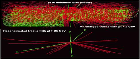
Figure 6
Simulation of a Higgs boson decaying to four Muons in CERN's CMS detector. The
upper image shows the event as it might appear on a monitoring screen in the
experiment’s Control Room, obscured by around 30 other, uninteresting, “minimum
bias” events. The bottom image disentangles the interesting Higgs event from
the rest.
When CERN’s LHC begins operating in late 2009, the four experiments will be looking for events that confirm existing theories about the structure of matter, and for those that indicate new physics, beyond the Standard Model. The predicted events that are of primary interest are those which indicate the existence of the Higgs boson. The Higgs can decay in several ways with “signatures” corresponding to the types of particles produced in the decay and their energies and distribution in the detectors.
In the Control Rooms of the experiments, there will be considerable activity, with physicists and engineers engaged in QA checks of the equipment and various other monitoring tasks that require close attention. As events are triggered and read out by the detector electronics, large displays of events such as that shown in Figure 6 will be continually updated. The Figure shows a proton-proton collision that has produced a Higgs boson that has decayed into four muons. The top half of the image is how the event will appear, and it shows that the four muons are almost invisible beneath a mess of other, less interesting ("minimum bias") events. The lower half of the Figure shows the Higgs event without the background, and labels the four muons clearly – since this is simulated data, the background can be explicitly removed like this. But this will not be possible with real data when the collider runs. Moreover, since most people in the Control Room will be busy with other tasks, and not continually watching the event display, this event might well not attract attention.
However, suppose all muons were "tagged" with a sound – we could use a simple mapping that plays a discrete tone for each detected muon in each event, with a pitch proportional to the muon’s transverse energy. With a suitable cutoff for muons with low transverse energy, only events with containing higher transverse energy muons would be heard. In this case, events like the one shown in the Figure would produce a chord of four notes, clearly audible in the Control Room. Other types of events containing a number N of high transverse energy muons would generate chords of N notes. By mapping other types of particles in the event (e.g. high energy photons) to distinctive sounds, different classes of events (e.g. Higgs decays to two photons) could be audibly distinguished. (A study of what works best in terms of sonification of the data is a major research goal of this proposal.) The sonification of events in this way is attractive because it does not require busy scientists in the Control Room to continually divert their attention from their primary tasks to visual displays: notable or interesting events are audible when they occur. This same technique could be used by individual researchers for rapid “scanning” of large numbers of events, looking for anomalous or rare examples: the researcher would be able to carry out the search without examining a visual display for each event.
It is worth emphasizing that the claim is not that sonification is the only way of detecting such events (one might simply color the muons according to their transverse energy, and hope they could be discerned amongst all the other particles) but rather that by sonifying them, we have an alert scheme that does not require attention and focus, and yet conveys significant information about interesting events.
We have obtained from the National Visualization and Analytics Centre (NVAC) at the Pacific Northwest National Lab (PNNL) the datasets used in the annual IEEE VAST challenges. We have examined the datasets from 2007[9] and 2008[10] in order to estimate how well our proposed system would be able to process them, represent them, and how it would be used to effectively identify the situational aspects and to provide answers to specific questions about the data. The datasets can be loosely characterized as mainly document and time log based. From the data one can generate graphs that link entities (people, places, objects, etc.) with events (cell phone calls, incidents, etc.) and with other entities. We have done some exploratory work with these datasets using the 3D glyphs and eigenvalues described earlier.
The task of understanding these datasets, and identifying the significant entities and their roles as a function of time, can be summarized as: “From a corpus of data such as emails, call logs, and other documents, perform an analysis to determine the members of a organization and their role in the enterprise, as a function of time, and recommend further observations and measurements to confirm the analysis”. This involves learning structure from relational observations, which can be binary, integer or real-valued, of different types and attributes, and which are often represented as dynamic heterogeneous networks (graphs). From the observations we wish to discover groups of objects (communities, clusters) and understand the structures in the data. In this sense, the FODAVA/Security datasets are no different to those from many fields of scientific measurement, including astronomy and particle physics, and similar techniques can be applied. In the special case of social networks, the analysis techniques are more specific, and there is a large body of work that addresses the topic, and for which software tools are available[[14]].
C.8.1 Year 1:
|
Q1 |
|
|
Q2 |
|
|
Q3 |
|
|
Q4 |
|
C.8.2 Year 2:
|
Q1/2 |
|
|
Q3/4 |
|
C.8.3 Year 3:
|
Y3 |
|
We wish to work closely with the FODAVA-Lead institution to receive advice on, and explore, ways in which the prototype system can be used by students and young researchers in science. In particular we believe that the system can be set up by novices to easily explore multivariate scientific data and thus to gain a better understanding of it. For classrooms, the installation of a replica of the prototype system, using an affordable, but capable single monitor, standard audio equipment and a generic desktop PC, will be easy - such a setup will be suitable for a small group of students who are studying scientific datasets. We will provide installation and operational guides that can be used to create a capable system and configure the software.
In addition to the obvious educational value of this project, it seems likely that the sonification capability will be attractive to visually impaired students and researchers, and that the system could be tuned (perhaps literally!) to the needs of these individuals. This is speculative on our part, and would require study and trials.
At both Caltech and JHU we will engage undergraduate students in the development and prototyping of the software and hardware components of the system.
This proposal comes from a collaboration of scientists, engineers and musicians. The team at Caltech’s Center for Advanced Computing Research includes specialists in multi-Terabyte scientific data analysis (PI J.Bunn and CoPI R.Williams), advanced scientific visualization (CoI S.Lombeyda), and statistical analysis (CoPI M.Stalzer), notably in the fields of particle physics, biology and astronomy. The Johns Hopkins University team comprises experts in large scale data collections and databases, and statistical analysis of multi-wave astronomy sky surveys (PI A.Szalay), together with musicians from JHU’s Peabody Institute of Music (CoI G.Wright). We are also fortunate to include leading figures from the electronic music industry (Audience Corporation’s Dana Massie, and EMU Systems’ Dave Rossum) who have extensive experience with sound synthesis and DSP, and who will act as consultants.